A Guide to Ad Creative That Converts
Learn to design high-performing ad creative. This guide covers formats, design principles, and analysis to help you create ads that drive real results.
An ad creative is the visual and written part of an ad people see. It combines images, video, headlines, and call-to-action buttons to tell your story and get your audience's attention. Think of it as the engine that makes your campaign go.
Understanding the Core of Ad Creative
Your advertising budget is the fuel for a race car. The ad creative is the car. You can pour the best fuel into the tank, but a poorly built car will not get far. It is the same with advertising. A huge ad spend cannot rescue a campaign with weak or confusing creative. Your ad's success depends on how well your message connects with the people you want to reach.
An ad creative is not just a pretty picture or a catchy slogan. It is a strategic piece of communication built to hit a specific business goal. Whether you aim to increase brand awareness, pull in new leads, or drive sales, every piece of your creative must work toward that objective. Everything from the color scheme to the font choice to the text on a button shows your value and nudges the user to take the next step.
The Building Blocks of Persuasion
An ad needs solid fundamentals to perform well. Each piece has a specific job, whether it is stopping the scroll, delivering the core message, or getting someone to click. If any one of these parts is weak, the whole ad suffers. These are the essentials.
Let's look at the different parts of an ad creative and what each one does.
Core Components of Ad Creative
Each of these elements must work together to create a persuasive and memorable experience for the user.
Why Strong Creative Is a Non-Negotiable
In today's crowded online space, your ad creative is often your first and only chance to make an impression. People scroll through their feeds quickly. A generic, uninspired ad is guaranteed to be ignored. Great creative stops the scroll. It creates an emotional connection and instantly shows people why they should care about what you offer. Some of the best brands have mastered this through storytelling. You can learn more in our guide on what is branded content.
The move to digital has put a bigger emphasis on strong visuals. Global video ad spend is on track to pass $207 billion in 2025 as brands follow their audiences onto mobile and streaming platforms. This investment proves a simple truth: campaigns with better creative and more compelling stories get better results. Putting real effort into your ad creative is essential for getting a positive return on your ad spend.
Choosing the Right Ad Creative Format
Picking the right ad creative format is like choosing the right tool for a job. You would not use a hammer on a screw. The format you choose needs to match your campaign goals, the platform you use, and the audience you want to talk to. Every format has its own unique strength.
The most common format is the static image ad. It is simple: one picture, some compelling text. Its biggest strength is its simplicity. You can get these running fast, which makes them perfect for straightforward promotions or getting your brand name out there. They get straight to the point.
Video ads are a different thing entirely. They are built for storytelling. With motion and sound, you can grab someone's attention, show how a complex product works, or build an emotional connection. Viewers retain 95% of a message from a video, compared to only 10% from text. This makes video an effective tool for driving engagement, especially on platforms like TikTok and YouTube.
Matching Formats to Campaign Goals
Your primary goal should always guide your format choice. Are you looking for immediate sales? Or are you trying to build a community and get people talking? The answer to that question will point you to the right creative format.
Think of it like a decision tree. Each goal leads down a different path to the best format.
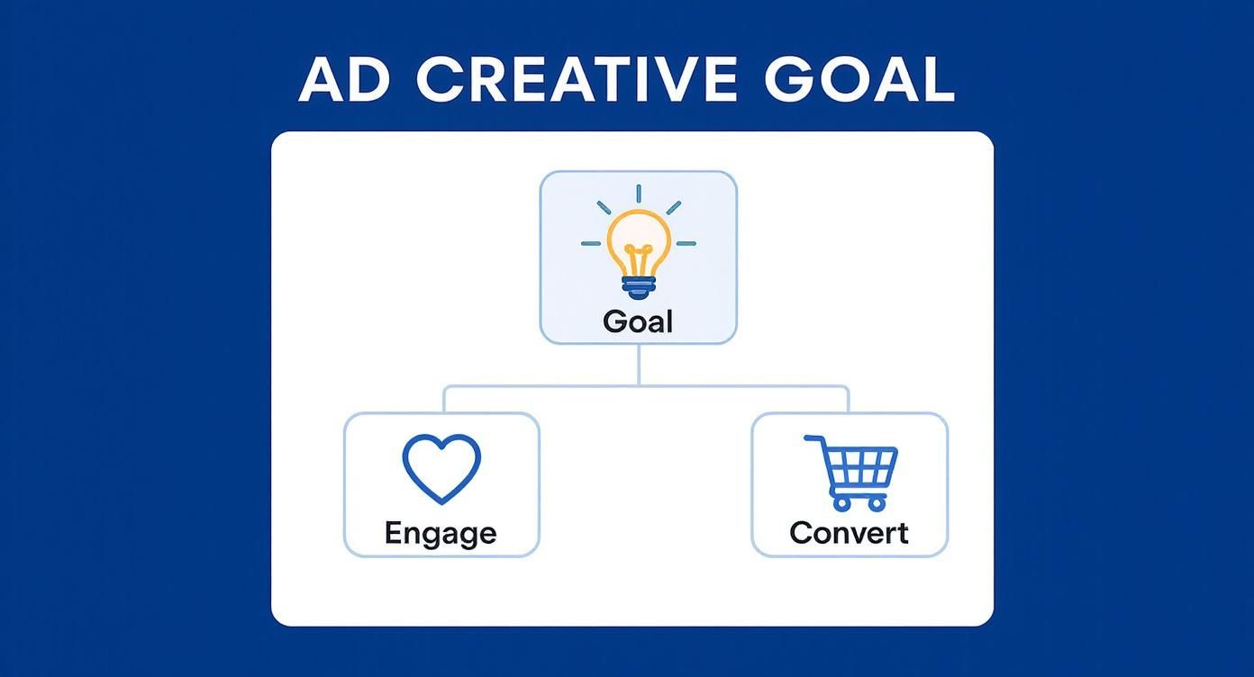
This infographic shows it visually. It shows how your objective, whether it is engagement or conversion, connects directly to a specific ad type.
Interactive and Multi-Part Formats
It does not stop at static images and simple videos. Interactive formats are designed to pull users in and get them to participate.
Take carousel ads. They let you show off several products or walk through multiple features in one ad that users can swipe through. They are a fantastic tool for e-commerce brands wanting to display a whole collection or for anyone trying to tell a story step-by-step.
Then you have playable ads, which are great for mobile apps. These are mini, interactive demos of your app. They give users a tiny taste of the experience. They are effective for driving installs. Anyone who enjoys the mini-game is already pre-qualified. They are far more likely to download and stick with the full app.
By letting users interact with a product before they commit, playable ads offer a "try before you buy" experience. This hands-on approach builds confidence and leads to higher-quality installs.
The Power of Authentic Content
There is a huge shift toward more authentic, human content. This is where user-generated content (UGC) comes in. It is about using photos, videos, and reviews from your actual customers in your ads. This approach builds trust and social proof because a recommendation from a peer feels more genuine than a polished ad from a brand. For more detail, read our guide on what is user-generated content.
The only way to know for sure is to test. Run an A/B test comparing a static image against a short video for the same offer. The data will tell you what your audience prefers.
As you decide, keep these three things in mind:
- Platform: Instagram Stories are made for vertical video, while the Google Display Network is still a stronghold for static images.
- Audience: Younger crowds often prefer video and interactive formats, while other demographics might respond better to a simple, clear image.
- Message Complexity: If your product needs a demo, video is your best bet. If you are pushing a simple discount code, a static image will do the job perfectly.
Choosing the right format is not about finding a single solution. It is about knowing your options and strategically aligning them with your goals to deliver your message in the most effective way possible.
Key Principles of High-Performing Ad Design
Great ad creatives do not happen by accident. They are the result of a deliberate strategy, combining a clear message, a smart visual flow, and a compelling reason for someone to stop scrolling and pay attention. Without these key pieces, even the most beautiful ad will fail.
At the heart of every winning ad is a strong value proposition. This is your promise to the user, answering their silent question: "What is in it for me?" You have about three seconds to get this across before they are gone, so it has to be instant and obvious.
That promise then needs to be backed up by a strong call-to-action (CTA). Your CTA tells people what you want them to do next. "Learn More" is vague. "Download Now," "Shop the Collection," or "Get Your Free Trial" are direct, action-oriented commands that eliminate confusion and make the next step simple.
Establish a Clear Visual Hierarchy
Think of visual hierarchy as a roadmap for the viewer's eyes. It is how you arrange things in your ad to show what is most important, guiding them from the headline to the final click in a logical sequence. A good hierarchy makes your ad easy to understand at a glance.
You can build this roadmap using a few simple design tools:
- Size: Whatever is most important, your headline or your product shot, should be the biggest thing on the screen.
- Color: A pop of bright, contrasting color is perfect for making your CTA button impossible to miss.
- Typography: Use bold or larger fonts for headlines to make them stand out from the rest of the text.
- Placement: We naturally look toward the top or center of an image first, so put your most critical info there.
When these elements work in harmony, the ad flows. A jumbled, disorganized ad forces the user to figure out your message. Most people will not bother.
Design for a Mobile-First World
The vast majority of people will see your ad on their phone. Designing for a small screen is not an afterthought. It is the starting point. This requires a different mindset than designing for a big desktop monitor.
For mobile, you need bold visuals that are easy to see and little text. No one wants to read a paragraph on their phone. Your CTA button also has to be big and chunky enough for someone to easily tap with their thumb.
A study found that 94% of a user's first impression is based on design. This is true for an ad and for a website. A clean, professional, mobile-friendly design builds trust in a split second.
This mobile-first approach also means thinking about the platform. An ad that looks great in a Facebook feed will need to be changed to work as an Instagram Story. Each channel has its own rules and user behaviors. The best advertisers create custom versions of their creatives for each specific placement. This makes the ad feel native and seamless wherever it appears.
Use Imagery and Color to Evoke Emotion
Your visuals are where the emotion of your ad lives. A single strong image can convey a feeling or a key benefit much more quickly than words. Always choose high-quality images that are directly relevant to your audience and what you offer. If your app is about relaxation, your visuals should feel calm and serene.
Color is another tool for tapping into emotion. Color psychology is real. It can subtly influence how people feel about your brand.
- Blue typically signals trust and security.
- Red can create a sense of urgency and excitement.
- Green is often tied to nature, health, and growth.
- Orange and Yellow feel energetic and optimistic.
Be intentional with your color choices. Use them to reinforce your core message and, most importantly, to make your CTA button stand out. When you combine a clear message, a strong visual hierarchy, and smart use of imagery and color, you create an ad that does not just get seen. It gets results.
Writing Ad Copy That Converts
A great visual might stop the scroll, but your words get people to act. The copy in your ad creative does all the heavy lifting, turning a moment of curiosity into a real decision. Great copy is sharp, persuasive, and feels like it speaks directly to your audience’s needs.
You have to be quick about it. People fly through their feeds, so you have a few seconds to land your message. This is getting more intense as content gets shorter and faster. Short-form video is projected to make up 29.18% of all ad creative consumption by 2025, thanks to platforms like TikTok. You need a hook that works instantly. For more on this, Single Grain has some great insights on creative ad trends.
Get to the Heart of Customer Pain Points
The best ad copy is not about your product’s features. It is about your customer’s problems. You need to start by focusing on the biggest frustration or challenge your audience faces. Your ad should hold that pain point up and say, "We get it."
Once you show you understand their struggle, you can introduce your product as the answer. Do not list technical specs. Show them how your offer makes that specific problem disappear.
Think of your ad copy as a bridge. On one side, you have a person's problem. On the other, your solution. Your headline is what convinces them to take the first step onto the bridge. The rest of your copy guides them safely to the other side.
For instance, instead of saying, "Our app features 256-bit encryption," try something like, "Keep your private data locked down for good." The second one is effective because it speaks to the real-world benefit of security and peace of mind.
Find Your Voice and Stick With It
Your brand voice is your company's personality. Are you buttoned-up and professional? Or are you witty and informal? Whatever it is, your ad copy needs to live and breathe that voice.
Consistency here is non-negotiable. If your ad is cracking jokes but your landing page reads like a technical manual, you will create a jarring disconnect. That kind of inconsistency kills trust and sends potential customers away.
- Define It: Write down what your brand sounds like. Use a few key adjectives and maybe even a list of words you love and words you'd never use.
- Live It: Make sure that voice is the same everywhere, in every ad, social post, email, and web page.
- Adapt It: Your core voice should stay the same, but you can change the tone for different platforms. Your LinkedIn ad will naturally feel a bit more formal than your TikTok ad, but they should both sound like they came from the same brand.
Crafting Headlines and Copy That Drive Action
Your headline has one job. It needs to stop someone mid-scroll and buy you a few more seconds of their time. The best headlines are specific, present a clear benefit, and spark curiosity.
Once you have their attention, the body copy has to deliver on the headline's promise. This is where you fill in enough detail to persuade them to click your call-to-action. Keep your sentences short and your language simple. No one has time to decipher jargon.
A simple, effective structure looks like this:
- The Hook (Headline): Grab them with a bold statement, a thought-provoking question, or a strong benefit.
- The Explanation (Body): Quickly explain how you deliver on that hook. Get straight to the point.
- The Ask (CTA): Tell them what to do next. Be direct with commands like "Get Your Free Quote" or "Download the App Now."
By focusing on real customer problems, speaking in a consistent voice, and structuring your message for impact, you can write copy that gets results.
How to Analyze Ad Creative Performance
Getting your ad creative live is the starting line. The real work begins when you start looking at the data to see what connects with your audience and what fails. This is where you stop guessing and start making smart, data-backed decisions that save you money.
This whole process comes down to tracking a few key numbers, called Key Performance Indicators, or KPIs. These metrics tell you the complete story of your ad, from the first impression to a customer making a purchase. If you are not watching these numbers, you are flying blind.
Key Metrics for Evaluating Ad Creative
To get a real sense of how well your creative is working, you have to look past surface-level things like likes and shares. Instead, you need to focus on the metrics that are directly tied to your actual business goals. Each number gives you a different piece of the puzzle.
When you put them all together, you get a clear picture of what is happening.
Consistently tracking these KPIs turns raw data into a clear roadmap. This guides you toward making better ads and getting a much better return on your investment.
Key Metrics for Ad Creative Analysis
Let's look at the essential metrics you should have on your dashboard. This table gives you a quick summary of what to track and why it is important for understanding your ad's effectiveness.
Getting a handle on these numbers is non-negotiable. For a deeper look into the cost side of things, you can find great tools to help, like this detailed guide on the customer acquisition cost calculator.
Using A/B Testing to Improve Results
How do you figure out what works? You test it. The most effective way to do this is through A/B testing, sometimes called split testing. It is a simple concept. You run two slightly different versions of an ad at the same time to see which one performs better.
You can test almost anything. For instance, you could run tests to compare:
- Different Headlines: Does a question work better than a bold, direct statement?
- Varying Images: Let’s find out if a clean product shot gets more clicks than a lifestyle photo of someone using it.
- New CTAs: Is "Shop Now" more effective than "Get 50% Off"? Test it and see.
- Color Schemes: A simple change, like a blue background versus a red one, can have a surprising impact on engagement.
The golden rule of A/B testing is to only change one thing at a time. If you change both the headline and the image in the same test, you will never know which element was responsible for the change in performance. This disciplined approach is what gives you clean, actionable insights.
By constantly testing and iterating on your creatives, you can systematically improve them over time. It is a cycle of learning and optimization that ensures your campaigns keep getting better and delivering stronger results.
Your Ad Creative Questions, Answered
Once you start with ad creative, a lot of questions pop up. Getting straight answers is the key to avoiding common mistakes and making better decisions for your campaigns. I have gathered some of the most common questions I hear from marketers to give you some practical guidance.
Think of this as your cheat sheet for campaign strategy. We will cover everything from what separates a great ad from a good one to knowing when it is time for a refresh.
What Makes a Good Ad Creative?
A great ad creative is not one thing. It is a perfect mix of visuals, words, and a call-to-action that all work together to hit your goal. The three non-negotiables are relevance, clarity, and persuasion. Your ad absolutely has to connect with the audience you want to reach.
It also needs to get your main point across in a split second. If people have to wonder what you are offering, you have already lost them. Finally, it has to give them a compelling reason to take that next step.
The best creative also feels like it belongs on the platform. An ad on TikTok should feel like a TikTok video, not a slick TV commercial that was awkwardly placed there. An ad’s real quality is measured by the results it drives, whether that is clicks, leads, or sales.
How Often Should I Refresh My Ad Creative?
There is no magic number here. The real signal to watch for is ad fatigue. This happens when your audience has seen your ad so many times they start tuning it out, and performance drops.
You will spot ad fatigue in your metrics. A rising cost-per-click (CPC) paired with a falling click-through rate (CTR) is the classic sign. For fast-moving campaigns on social media, you might need to swap in fresh creative every one to two weeks. On slower channels like search, a strong creative could have a much longer shelf life.
The smartest way to handle this is to always be testing. Have your next batch of creative variations approved and ready to go the second you see performance start to dip. This keeps you ahead of the curve and prevents your campaigns from stalling.
A disciplined testing rhythm is what keeps campaigns performing well. Maintaining a library of ready-to-launch creative makes this whole process feel less like an emergency and more like a well-oiled machine.
What Are Common Ad Creative Mistakes to Avoid?
One of the most frequent mistakes I see is creating one "master" ad and expecting it to work everywhere. It will not. Every platform has its own specs, its own culture, and its own user expectations. An ad that works well on Facebook will likely fail on LinkedIn if you do not adapt it.
Another huge one is a weak or unclear call-to-action (CTA). If you do not tell people exactly what you want them to do next, they will keep scrolling. Be direct and make it sound appealing.
Here are a few other problems to avoid:
- Using Low-Quality Visuals: Grainy photos or shaky videos immediately make your brand feel unprofessional and untrustworthy.
- Overloading with Text: Walls of text on an image or in a video are a recipe for being ignored, especially on a phone screen.
- Failing to Stand Out: If your ad blends in with everything else in the feed, it is invisible. Do not be afraid of bold colors or unique imagery.
- Ignoring Mobile Design: The vast majority of ads are seen on a smartphone. Designing for a small, vertical screen is not optional. It is the standard.
Avoiding these common mistakes will instantly put your ads in a better position to succeed.
How Do I Get Started If I Have a Small Budget?
A small budget means you have to be smarter and more focused. You do not need a Hollywood-level production to create ads that work. Your focus should be on clear messaging and high relevance.
Start with simpler formats, like static image ads. They are cheaper and faster to produce than video. You can use high-quality stock photography or create clean, simple graphics that get your core message across. Put your limited budget on one platform where you know your audience lives.
Here is a simple game plan:
- Identify Your Core Message: What is the one thing you need your audience to remember?
- Create Simple Visuals: Design a handful of clean, eye-catching image ads.
- Write Direct Copy: Create a clear headline and a CTA that is effective.
- Target a Niche Audience: Focus your ad spend on a small, hyper-relevant group of people.
- Track Everything: Watch your CTR and cost-per-acquisition (CPA) closely to learn what is working.
This focused approach helps you learn and improve without wasting money.
Should I Use AI to Generate Ad Creative?
AI tools are quickly becoming an effective ally, especially for teams that need to produce many ad variations for testing. These platforms can rapidly mix and match headlines, images, and copy to generate dozens of options in minutes.
That speed lets you test more ideas and find winning combinations far faster than any human could. AI can also analyze performance data to offer suggestions on which creative elements are most likely to connect with an audience, helping you make smarter, data-backed decisions.
Think of AI as an assistant, not a replacement for human strategy. Your deep understanding of your brand and your audience is still the most critical ingredient. Use AI to scale your production and speed up your testing, but always guide the process and ensure the final creative truly reflects your brand.
Ready to scale your app's growth with high-performing ad creative? The experts at Adworkly combine human strategy with AI-powered execution to deliver results. See how we can help you grow.